Laundry Pickup
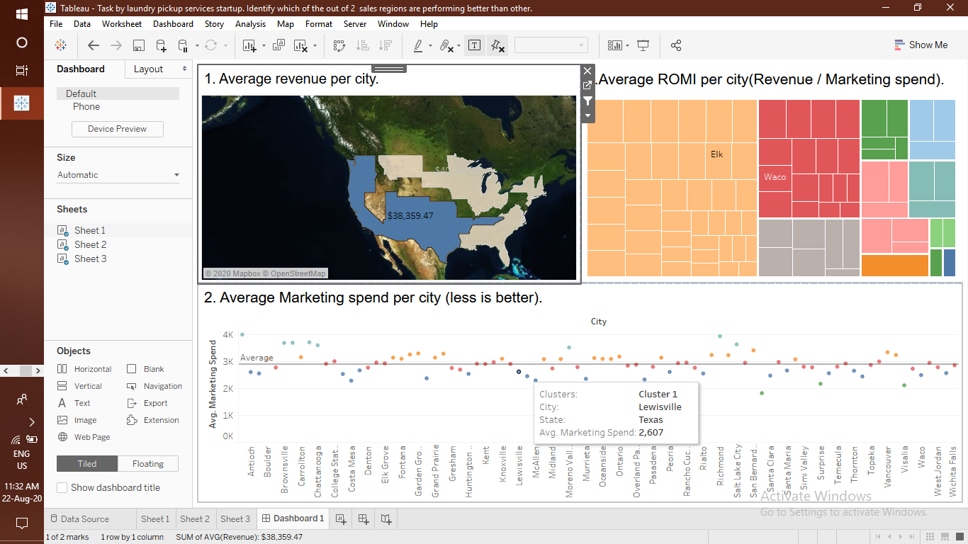
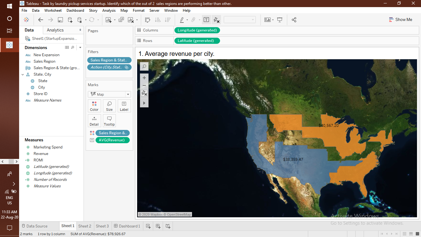
Visualisation of Revenue Collected in USA.
Laundry Pickup
This Project is based on the revenue collected by providing Laundry pickup services throughout the country
and visualised in the dashboard.
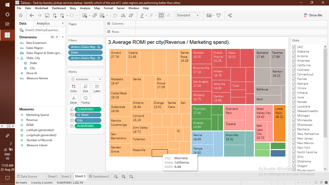
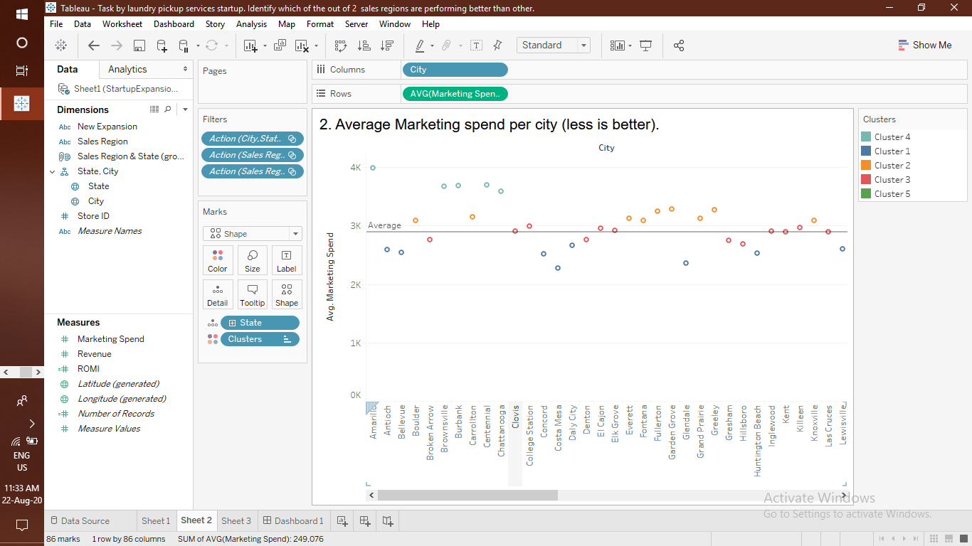
The Visualisation takes place in three processes which is being arranged accordingly in the dashboard.
The first process visualises the revenue being collected and showed in the bar chart.
The second process visualises the coutry map where maximum revenue being collected.
The third process visualises the weekly gain in the revenue.
This was a college assignment which was given by the faculty of Data Science in the 6th Semester
I cleaned the data first of all and blended the data according to the relationships and then performed visualisation.
This was my first time when i performed a Visualisation of data sheet and collecting as much information for the same and displaying it.